The Borrower's Atlas
8.16.2016
6.14.2016
Crazy for the Hanbok
It's been a while. Too long! Since I'm wedding planning now (it's still over a year away but you can never start too early?) figuring out what dress to wear is the hardest thing ever. The only dresses I've tried on so far are traditional Hanbok's. They're so colorful, airy, flowy, and original. Here are a few modern Hanbok's that I'm falling for.
4.03.2015
Gallery Wall
I've been thinking about how to hang a gallery wall these days. Since everyone and their dog has a 'how-to' on hanging an art wall I figured I'd just point to a bunch of them rather than write one myself. The West Elm Blog has a great post on how to do this. Check it out! And check out these fun walls (and their how-to's) for inspiration:
Black and white and patterns and leather. My favorite combinations.
3.20.2015
House Plants
Our apartment has some lonely corners. It's still in a state of emptiness (we have too much space for two of us at the moment). One room is still completely bare aside for our bikes that are hanging out against the wall. Furnishing the place has definitely been a process and we're taking our time with it. We have been craving some greenery though. Timmy bought an avocado tree that will be here sometime within the month. And me? I'm going to paint some plants. Inspired by these talented people:
Jonas Wood featured on Miss Moss
3.05.2015
Winter Blues
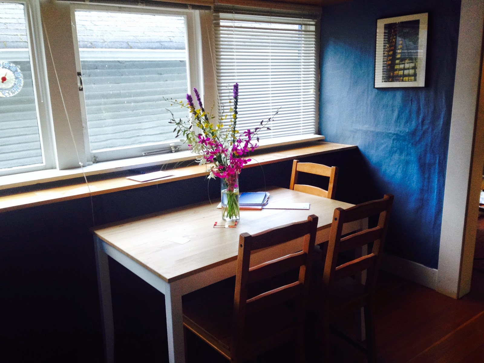
I snagged a job as a Home Stylist at West Elm here in Seattle, and with all the training I've done so far, I feel more confident with fixing up our home. Before I was overwhelmed with all of the patterns, textures, colors, and arranging spaces in general. I was afraid of committing to a color or a pattern and didn't want to clutter up our space. But I'm taking it one room at a time. Starting with the foyer! So far, its a storage room and the dining room, it's small, and the walls are dark blue with a red ceiling! (I know...red ceiling?) I keep thinking it's a good spot for our dining room table but Timmy thinks the table would look better in our first living room (we have two living rooms). SO! Currently, I'm working with the foyer as a storage room/place to hang out and chat with whoever is in the kitchen. I wanted the paint the walls a lighter color to make the room feel bigger but since I'm broke and we're not going to be here forever, I'm working with what we have. These blue pictures are inspiring because I can see that white, dark blue, and natural colors all look pretty great together.....Here's the foyer so far. The wall behind the table has tons of shelves that I've covered with a piece of dark blue cloth. It helped the room feel cleaner and more spacious without sight of all that clutter. More later!
Don't mind the blurry photos!
2.01.2015
Interiors
Subscribe to:
Posts (Atom)


